top of page
The Look:
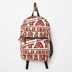
This gritty logo resembles a vintage, metal stamp. The colors are black and antique white, with red and blue variations. The wrench denotes Granite State Field Service's general field of work, but the logo's overall impression lets people know you're willing to work hard and get dirty.
The Feel:
The Iron Work logo concept was inspired by old industrial logos. Think iron workers, blue collar laborers, and the good old days where you earned a dollar with hard work. There might also be a faded flag gently blowing in the breeze in the background.


bottom of page


